Understanding the colours that complement you — without turning your wardrobe into a rulebook.
Service 01
The Style
Edit.
Your style. With more intention.
Personal style isn’t about following every trend.
It’s understanding what deserves a place in your wardrobe — and why.
The Style Edit explores the elements that shape your individual look: silhouette, proportion, colour, lifestyle, personality and the way you naturally want to present yourself.
Together, we begin developing a wardrobe language that feels polished, relevant and unmistakably yours.
Begin your Style EditLearning why certain combinations simply look better together.
Understanding shape, structure and how clothing interacts with your body.
Making more intelligent decisions about what stays, what goes and what is genuinely missing.
Learning to shop with purpose rather than collecting clothing that never quite works.
The shoes, accessories and finishing touches that can completely change an outfit.
Your palette
Your colour language
Find the colours
that find you.
Undertone is a clue. Harmony is the answer.
Colour analysis considers three qualities together: whether colour reads warmer or cooler beside your skin, whether your natural colouring is light or deep, and whether you are supported by clear contrast or softer, muted combinations.
Blue or violet-looking veins on very light skin can suggest a cool undertone, but they do not confirm a season on their own. Natural light, surface redness, hair and eye colour, and the effect of actual fabric beside the face all matter.
Temperature
Compare warm ivory with clear white, then antique gold with silver. Notice which side makes the skin look rested rather than sallow, grey or flushed.
Value & contrast
Look at the natural difference between skin, eyes and hair. Gentle colouring often holds softer combinations; stronger contrast can carry clearer light–dark separation.
Clarity
Compare a crisp colour with a greyed version of the same family. The better cloth should bring the face forward; the other may appear to wear you.
Try this at home
Use daylight.
Remove distraction.
- Sit near a window in indirect daylight, without makeup, self-tan or coloured reflections nearby.
- Pull hair away from the face, especially if it is dyed, and hold each comparison just below the chin.
- Compare in pairs: cream or white; camel or cool grey; tomato red or blue-red; olive or emerald.
- Watch the face—not the cloth. Look for more even skin, clearer eyes, a defined jawline and fewer visible shadows.
- Photograph each pair in the same light. Review the face first and record patterns rather than choosing a favourite colour.
Seasonal names are a useful shorthand, not a verdict. For another introductory perspective, read the C&A colour analysis guide .
The seasonal shorthand
Four families.
Many individual palettes.
Traditional colour analysis groups recurring combinations into four seasons. A professional edit goes further than matching hair or eye colour: we drape, compare and refine until the palette works on the person in front of us.
Spring
Sun-warmed coral, camel, leaf green and clear aqua.
Summer
Powder blue, slate, soft berry, navy and dove grey.
Autumn
Olive, tobacco, cream, rust and warm chocolate.
Winter
Ink navy, optic white, emerald, blue-red and charcoal.
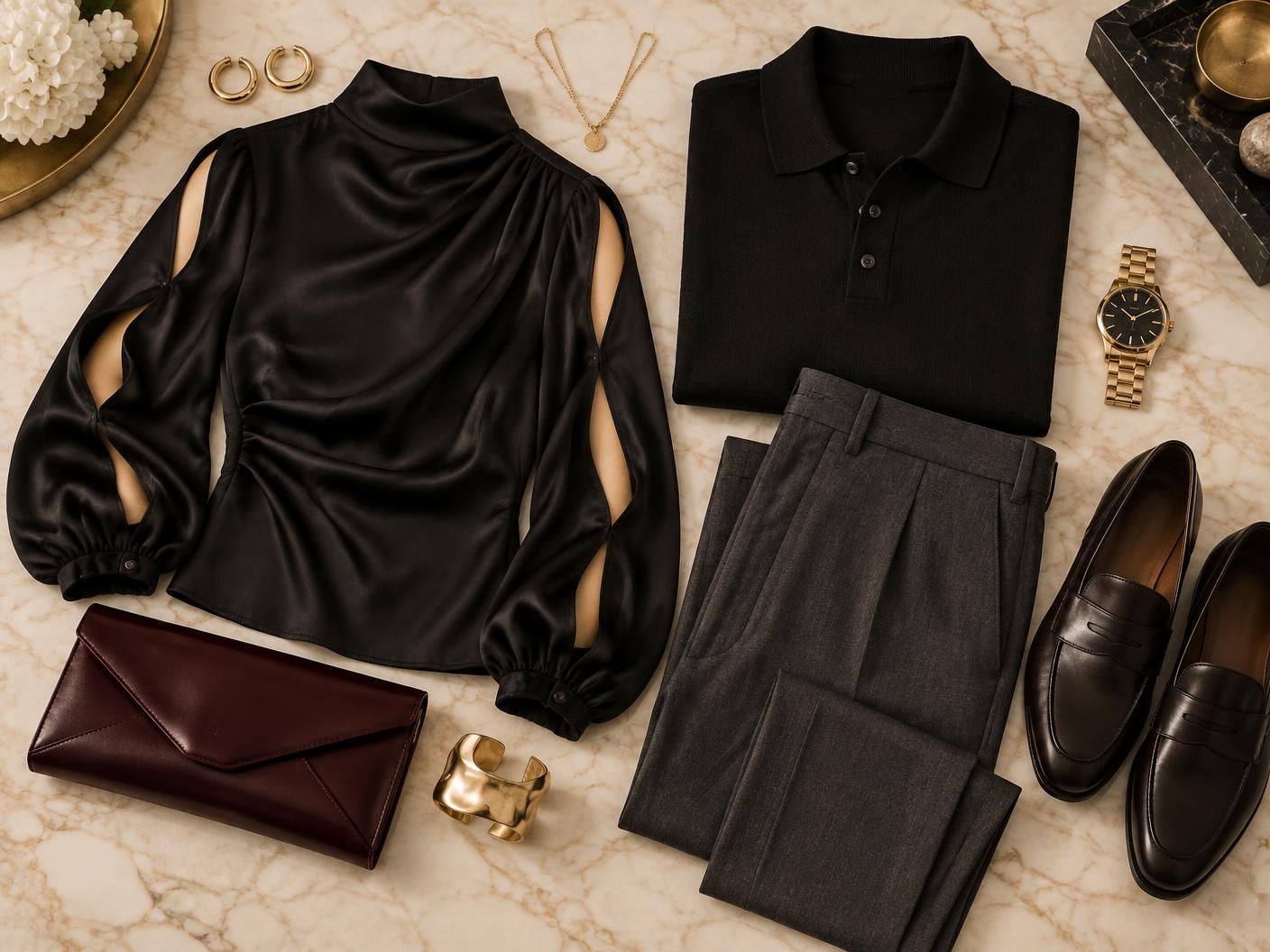
Featured within The Style Edit
Fewer pieces.
More ways
to be seen.
A capsule should make dressing easier without making a woman disappear. It is built around your body, diary, climate, work, social life, care preferences, budget and point of view—not a universal list of beige basics.
Illustrative case study
Forty. Working.
Ready to feel visible.
She is a 40-year-old working mother who wants to dress conservatively, yet feel valued and seen at work and at ease with friends. She frequently stands before a full wardrobe and feels she has nothing to wear. Her very light skin and blue-visible veins offer an initial clue toward cool colouring—not a final diagnosis.
- The life
- Office, presentations, school routines, friends and family weekends
- The intention
- Quiet authority, femininity, composure and enough personality to be remembered
- The problem
- Too many disconnected pieces; too few reliable outfit formulas
- The colour hypothesis
- Cool-leaning, likely flattered by softened or deeper cool tones; confirmed only through draping
Before we choose a garment
The information
that changes everything.
A dress size is a starting point, never a definition. Because sizing differs by label, measurements and fit preferences allow Tina to shortlist intelligently and make boutique appointments more personal.
Measurements
Height; bust, waist and hip; inside leg; shoulder and preferred garment lengths.
Sizing reality
Usual dress, trouser, bra and shoe sizes—plus brand variations and fit frustrations.
Real life
Workdays, school runs, social plans, travel, climate, laundry and how often pieces must repeat.
Dress context
Workplace expectations, visibility, presentations and the line between conservative and invisible.
Personal signals
Colours loved or avoided, jewellery preference, hair and eye colouring, and how fabrics react beside the face.
Comfort & access
Heel tolerance, footwear needs, sensory preferences, mobility, modesty and alteration requirements.
Measurements and sizing are gathered privately during client discovery and used only to support fit, sourcing and alteration decisions.
The process
From uncertainty
to an outfit map.
The conversation
We begin with how you live and how you want to feel: visible but not exposed, polished but not overly formal, capable at work and still yourself over dinner.
The practical brief
We record measurements, usual dress and shoe sizes, preferred fits, mobility needs, work dress codes, weekly diary, climate, care preferences and budget.
The wardrobe evidence
Photographs and a considered wardrobe review reveal what is worn repeatedly, what never feels right, where duplication exists and which genuine gaps create daily indecision.
Colour & proportion
Fabric draping refines temperature, depth and clarity. Outfit trials establish useful lengths, volumes, waist placement, jacket structure and the most effective scale of detail.
The capsule architecture
A small set of hardworking pieces is planned around repeatable outfit formulas—not an arbitrary item count. Every addition must connect to several others.
Source, fit & refine
Existing pieces come first. Genuine gaps are sourced across boutiques, local designers, high street and investment labels, then assessed for fabric, fit, alterations and cost per wear.
The personal lookbook
The finished edit becomes photographed outfit combinations for work, school-run days, presentations, dinners and weekends, with notes on shoes, layers and finishing details.
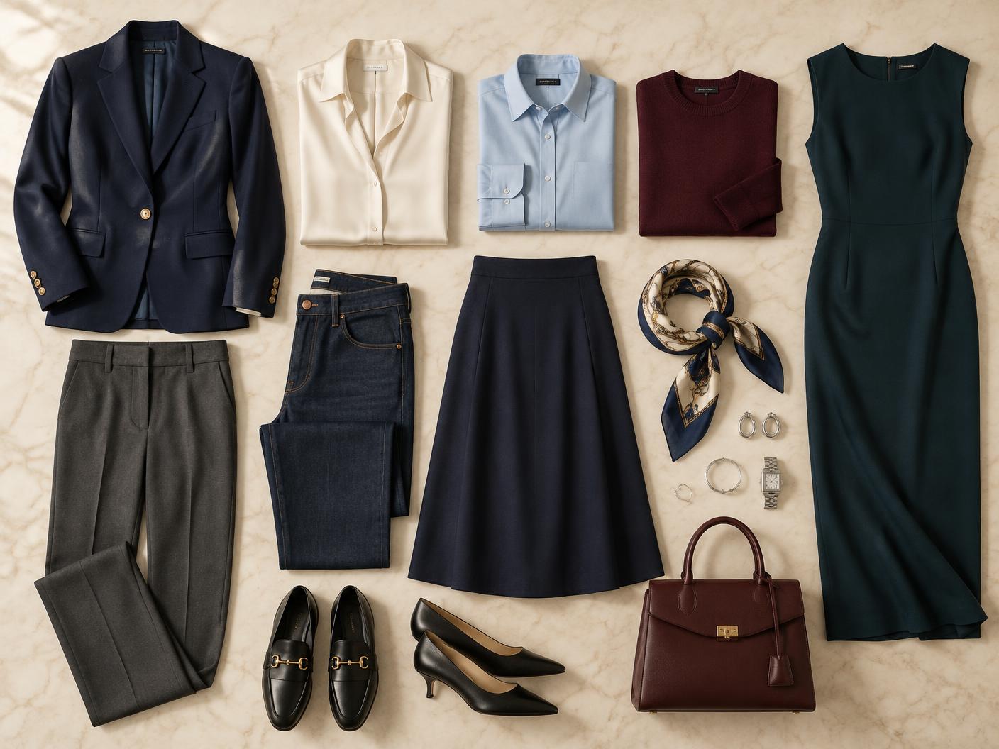
The proposed edit
Twelve pieces.
One clear point
of view.
This example uses cool navy and charcoal as quieter alternatives to head-to-toe black. Ivory and soft blue lift the face; burgundy and deep teal add composed colour. Silver details echo the cool direction. Final choices would follow an in-person or online assessment.
- Navy tailored blazer
- Charcoal straight trouser
- Ivory fluid blouse
- Soft-blue cotton shirt
- Burgundy fine knit
- Dark indigo jean
- Navy midi skirt
- Deep teal column dress
- Black leather loafer
- Low pointed heel
- Oxblood structured bag
- Silver jewellery & silk scarf
The outfit map
Decisions made
before Monday morning.
Navy blazer + ivory blouse + charcoal trouser + loafer
Soft-blue shirt + dark denim + blazer + oxblood bag
Deep teal dress + navy blazer + pointed heel + silver jewellery
Burgundy knit + navy midi skirt + loafer + scarf
Deep teal dress + oxblood bag + pointed heel
Ivory blouse + dark denim + loafer + sculptural silver detail
This capsule is an illustrative styling example, not a prescription based on age, colouring or body type. A real client’s pieces, palette and fit are refined from her measurements, draping, preferences, budget and existing wardrobe.
Your next chapter
Know what to wear.
Know why it works.
Begin with a conversation. Tina will discuss your wardrobe, your life and the next appropriate step within The Style Edit.
Start your Style EditYour colour language
Your palette is a tool.
Not a rulebook.
Colour can energise, soften, sharpen and completely change the way an outfit communicates.
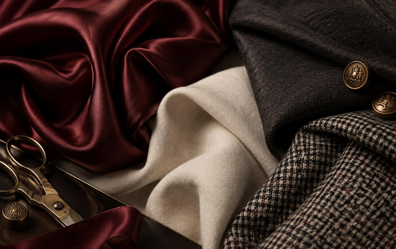
Why does one white shirt look exceptional while another looks ordinary?
Why does one pair of trousers fall beautifully while another never quite sits correctly? Often, the answer isn’t the label. It’s the fabric.
The Fabric Edit introduces the details that influence how clothing looks, moves, wears and feels.
Discover the Fabric EditHow fabric falls and moves around the body.
Why weight can completely alter the structure of a silhouette.
Using surface and texture to create visual interest.
When shine elevates a garment — and when it can overwhelm it.
Learning to read labels and understand what you are actually buying.
Looking beyond the brand name to seams, lining, buttons and finishing.
The cloth index · luxury scale out of 10
Know what
you’re wearing.
A garment label names the ingredients. The hand-feel, weave, weight and construction reveal how those ingredients will perform.
The luxury score is Tina’s editorial guide to rarity, hand-feel, drape and workmanship potential—not a scientific grade or guarantee of price, ethics or durability.
| Fabric | Luxury | What it comes from | How it behaves | Often used for | Skin sensitivity |
|---|---|---|---|---|---|
| Cashmere | 9/10 | Animal · the fine undercoat of cashmere goats | Exceptionally soft, insulating and light | Knitwear, scarves and elevated layers | Usually gentle because the fibres are very fine; lower grades or blends may still prickle. |
| Silk | 9/10 | Animal · filament from the cocoon of the silkworm | Fluid, light and naturally lustrous | Blouses, dresses, scarves and refined linings | Usually gentle; dyes, finishes or residual silk gum can trouble some sensitive skin. |
| Fine wool | 8/10 | Animal · fleece shorn from sheep; merino is a fine grade | Warm, resilient and beautifully responsive in tailoring | Coats, knitwear, trousers and jackets | The most likely to itch in this edit when fibres are coarse. Fine merino is often better tolerated. |
| Linen | 7/10 | Plant · bast fibre from the stem of the flax plant | Crisp, breathable and softly textured with wear | Summer tailoring, shirts, trousers and dresses | Usually well tolerated; raw or unwashed linen may feel abrasive on very sensitive skin. |
| Tweed | 7/10 | Construction · traditionally woven sheep’s wool; blends vary | Structured, dimensional and often warm | Jackets, coats, skirts and statement tailoring | Coarse wool tweed can prickle; lining keeps its textured surface away from the skin. |
| Cotton | 6/10 | Plant · soft seed fibres surrounding the cotton boll | Breathable and versatile; quality varies with staple and weave | Shirts, poplin dresses, tees, chinos and denim | Often among the gentlest options; stiff finishes, dyes or seams may matter more than the fibre. |
| Denim | 6/10 | Construction · usually cotton twill, sometimes blended with elastane, hemp or lyocell | Firm to fluid depending on weight and stretch | Jeans, jackets, skirts and structured shirts | The cotton base is usually gentle; rigid cloth can chafe and some dyes or finishes may irritate. |
| Viscose | 5/10 | Regenerated plant cellulose · usually wood pulp, dissolved and spun | Fluid, breathable and often silk-like | Dresses, blouses, linings and wide-leg trousers | Generally soft; sensitivity is more likely to involve dyes or finishing treatments than cellulose itself. |
| Satin | 5/10 | Construction · a weave made in silk, viscose, polyester, nylon or blends | A smooth face with sheen and fluid movement | Evening pieces, skirts, shirts and occasion separates | Depends on the fibre: silk satin can feel gentle, while synthetic satin may trap heat and perspiration. |
| Polyester | 2/10 | Synthetic · petroleum-derived PET polymer extruded into filaments | Durable, colourfast, easy-care and highly variable | Pleats, linings, technical garments and structured fashion | Rarely a true fibre allergy, but low breathability may trap heat and perspiration and aggravate reactive skin. |
Skin response is individual. Fibre diameter, weave, dyes, finishes, heat and friction all matter; this guide is educational and not medical advice.
Textiles through time
Fabrics and
their history.
“You shall not wear cloth of wool and linen mixed together.”
Deuteronomy 22:11 names wool and linen directly, while Leviticus 19:19 refers to a garment woven from mixed material. In Jewish tradition, the wool-and-linen combination is known as sha’atnez.
Some faith-based and alternative-wellness traditions believe that every part of creation—including the human body and natural textiles—carries a distinctive energetic frequency. Within that belief system, pure linen and pure wool are sometimes described as high-frequency fibres associated with vitality, purity and the body’s intended relationship with natural materials. Choosing garments made from 100% linen or wool can therefore be understood as a spiritual return to simplicity and natural design.
This is a spiritual interpretation, not an established medical or textile-science finding. Claims that a fabric frequency supports cellular health have not been demonstrated by reliable clinical evidence.
Read the passages: Deuteronomy 22:11 · Leviticus 19:19
The science behind it
Opposite fibres.
A considered blend.
Wearing wool and linen together—or blending them in one cloth—is not known to cause medical harm. Their contrast is practical: linen is naturally cooling, while wool is naturally insulating. Combining them changes how the finished garment manages heat, moisture, movement and care.
| Property | Pure linen | Pure wool | When blended |
|---|---|---|---|
| Thermal behaviour | Flax fibres conduct heat readily and an open weave encourages airflow, helping warmth leave the body. | Natural crimp traps small pockets of air, creating insulation that helps retain warmth. | The cloth usually becomes moderately insulating rather than delivering linen’s strongest cooling or wool’s fullest warmth. |
| Moisture response | Absorbs moisture and releases it readily, so it can feel cool and dry relatively quickly. | Can hold substantial moisture vapour within the fibre while its surface still feels dry; absorption also releases a small amount of heat. | Drying and moisture management depend on the fibre ratio and construction, and are often slower than in a light pure-linen cloth. |
| Texture & care | Smooth, low in elasticity and naturally inclined to crease. | Elastic, resilient and springy, but vulnerable to felting or shrinkage with heat and agitation. | Wool can improve resilience and reduce creasing, while the different shrinkage behaviours require careful laundering. |
Linen · breathability & heat release
Linen is spun from cellulose fibres found in the flax stem. Its moisture absorbency, thermal conductivity and firm structure allow perspiration and body heat to move away efficiently. The space created between a crisp linen cloth and the skin also supports air circulation—one reason it performs so well in warm climates.
Wool · insulation & regulation
Wool is a protein fibre, most commonly shorn from sheep. Its natural waves create insulating air pockets. It can absorb moisture vapour without immediately feeling wet, and the absorption process produces a small amount of heat. These qualities help wool buffer changes in temperature, particularly in cool conditions.
For most people, both pure fibres and modern blends are wearable. Individual sensitivities may involve coarse wool, friction, dyes or finishes rather than the wool-and-linen combination itself. This material is educational and does not replace personal medical advice.
A more discerning eye
Look at the fabric
before you look
at the label.
Service 03
Skin first.
Makeup second.
Beauty should complement your style — not compete with it.
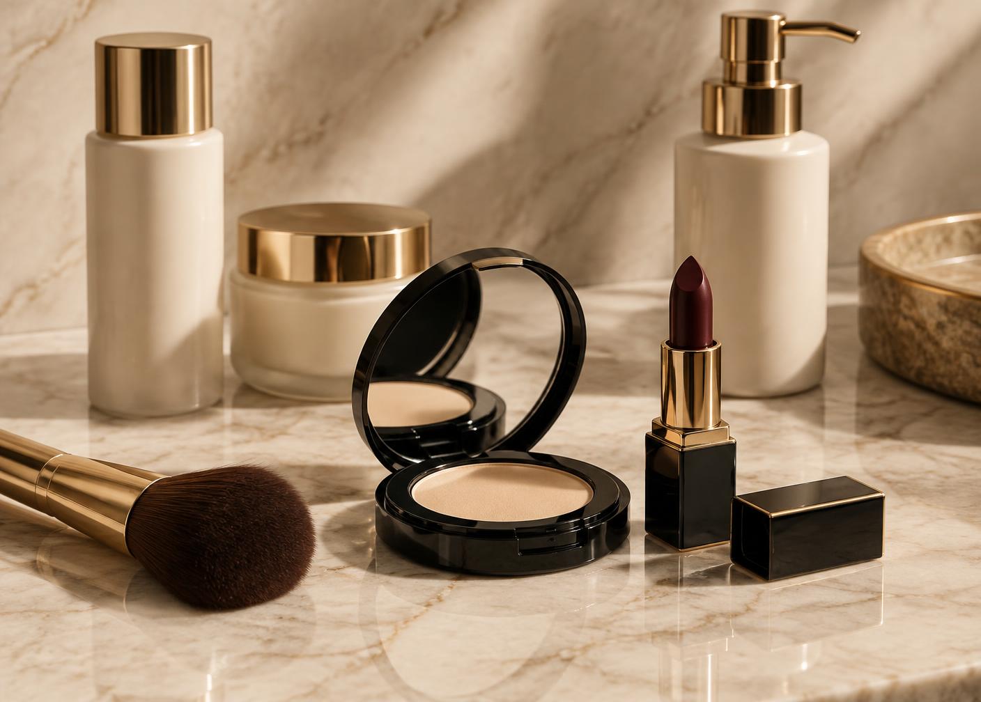
The goal isn’t a different face. It’s a polished version of the one you already have.
The Beauty Edit explores a more considered approach to everyday beauty: uncomplicated skin routines, refined makeup choices and techniques that enhance rather than disguise.
Guidance is educational and cosmetic, designed around practical routines and personal preference.
Explore the Beauty EditThe Skin Edit
Less, but better.
Build a routine around what you will use consistently: cleanse, moisturise and protect by day. Add one considered extra only when it has a clear purpose.
Cleanse with restraint
Choose a gentle cleanse that removes the day without leaving skin feeling tight. More foam does not mean a better result.
Layer light to rich
Apply water-light formulas before creams and oils. Give each layer a moment to settle instead of piling on more product.
Protect in the morning
Make broad-spectrum sun protection the final skincare step before makeup. Reapply according to the product directions and your day.
Reset in the evening
Remove makeup fully, cleanse gently and use a simple moisturising step. Consistency is more useful than a crowded shelf.
The Five-Minute Face
Refined, not disguised.
Begin with healthy-looking skin, then use strategic concealer, groomed brows, subtle colour, mascara and a lip that feels intentional.
Prepare the canvas
Well-moisturised skin often needs less base. Let skincare settle, then place complexion product only where it earns its place.
Place concealer precisely
Use a small amount at the inner eye, around the nose or on an isolated mark, then soften the edges rather than covering the whole face.
Build in fine layers
Cream colour and powder are easier to control when applied sparingly. Step back between layers and look at the whole face.
Choose one point of emphasis
A considered lip, defined eye or luminous skin can lead the look. Not every feature needs to speak at the same volume.
A beauty wardrobe
Make every product earn its place.
Think of your makeup bag as you would a well-edited wardrobe: reliable foundations, flattering colour, versatile textures and one or two pieces with personality. The right choices should support the way you dress and the way you want to feel.
For current runway references, artist interviews and wider beauty reporting, explore Vogue’s makeup coverage . Trends are inspiration, never an instruction to replace what already works for you.
For considered nail and beauty care, Tina’s preferred provider is Splash Nail & Beauty .
The Beauty Edit offers general cosmetic and lifestyle education. It does not diagnose or treat skin conditions; seek a qualified medical professional for individual concerns.